“Poetrica” by Giselle Beiguelman
Title:
Artist(s) and People Involved:
Exhibiting Artist(s):
-
Giselle Beiguelman
-
- Universo Online
- Sergio Motta Institute
Symposium:
Medium:
Artist Statement:
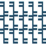
Poetrica is a series of visual “post-poems.”
The process for composing these pieces involves using algebraic operations and non-alphabetic fonts (system fonts and dings). This process results in “imagetic” meanings and what I call “post-poems.” They do not aim to make textual meaning emerge from the visual surface by the way concrete and visual poetry did. Poetrica generally aims at just the opposite: to create visual meaning from non-textual characters, exploring new boundaries of non-phonetic language.
Every no-poem has in its title the equation that was typed before the sequences of operations (additions, superpositions, divisions, etc.).
In addition, each no-poem has a colophon, placed at the bottom, specifying the name of the font, size of the font, and whether or not it has a vector effect.
Conceived for PDAs, the Web, and for unusual dimensions of paper and printing methods (like plotters and stickers), Poetrica also explores contexts of reading and perception.
Even when re-sized and saved as something “new”, they are always made of the same information. Said another way, they are all second generation originals.
Other Information:
Poetrica has among its sources of inspiration: Rafael Lain, Brazilian typographer, author of some fonts used here, “Introduction to the Letter T”, poem by Barrett Watten (Sun & Moon Classics, 2000) and “desbragada”, by Edgar Braga (org. Regis Bonvicino, 1984). In some ways, Poetrica develops some issues that I explored in my first cyber-work (The Book after the Book – www.desvirtual.com/thebook, 1999).
The epigraph of that work was: “@+ +#e !n+ersc+!0n$ o, w0r&$ @n& $ymb0J$ we %eg!n +0 re&e, !ne Our %0un&er!e$” (at the intersections
of words and symbols we begin to redefine our boundaries . .) Poetrica has this statement in its core …
Additional Images:
- 2002_Beiguelman_Poetrica_02


